Difference between revisions of "RADAR"
Jump to navigation
Jump to search
(Created page with "<div style="font-size:30px">'''BUBBLE CHART'''</div> ==='''''Description:'''''=== '''''Bubble chart is used when we want to represent 3 sets of data in a graphical way.'''''<b...") |
|||
| (5 intermediate revisions by the same user not shown) | |||
| Line 1: | Line 1: | ||
| − | <div style="font-size:30px">''' | + | <div style="font-size:30px">'''RADAR CHART'''</div> |
==='''''Description:'''''=== | ==='''''Description:'''''=== | ||
| − | ''''' | + | '''''The Radar Chart, also sometimes called a spider or star chart, lets us compare multiple items against multiple criteria.'''''<br> |
| − | ''''' | + | '''''You could use it to see how temperatures change in multiple locations over the course of a year, or quickly compare products in several different areas.''''' <br> |
| − | *''''' | + | *'''''Radar Chart has X & Y axis. |
| − | *''''' | + | *'''''The x-axis is nothing but each end of the spider and each step of the spider considered as Y-axis. |
| − | *'''''It is a X vs | + | *'''''Zero point of the radar chart starts from the centre of the wheel. Towards the edge of the spike, a point reaches, the higher the value. |
| + | *'''''It is a X vs (Y1,[Y2]....) graph.''''' | ||
| + | **'''''X-axis represents one set of data. | ||
| + | **'''''Y-axis can represent single or multiple data sets. | ||
==Example== | ==Example== | ||
| Line 12: | Line 15: | ||
| A|| '''B''' || '''C'''|| '''D''' | | A|| '''B''' || '''C'''|| '''D''' | ||
|- | |- | ||
| − | | | + | | || '''Vendor 1''' || '''Vendor 2''' || '''Vendor 3''' |
|- | |- | ||
| − | | | + | | Reliability || 65 || 73 || 49 |
|- | |- | ||
| − | | | + | | Customer Service || 68 || 6 || 72 |
|- | |- | ||
| − | | | + | | Customer Satisfaction || 80 || 54 || 92 |
|- | |- | ||
| − | | | + | | Expandability || 70 || 68 || 62 |
|- | |- | ||
| − | | | + | | Cost || 66 || 70 || 52 |
| + | |- | ||
| + | |Quality || 64 || 73 || 54 | ||
| + | |- | ||
| + | |Features || 67 || 66 || 72 | ||
| + | |- | ||
| + | |Maintenance Costs || 72 || 59 || 80 | ||
|} | |} | ||
| − | ''' | + | '''RADARCHART(A1:D9)'''<br><br/> |
[[File:Radar.JPG]]<br><br/> | [[File:Radar.JPG]]<br><br/> | ||
[[GRAPHING|'''''GRAPHING MAIN PAGE''''']] | [[GRAPHING|'''''GRAPHING MAIN PAGE''''']] | ||
Latest revision as of 10:27, 9 June 2020
RADAR CHART
Description:
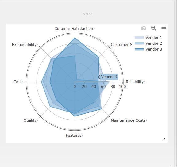
The Radar Chart, also sometimes called a spider or star chart, lets us compare multiple items against multiple criteria.
You could use it to see how temperatures change in multiple locations over the course of a year, or quickly compare products in several different areas.
- Radar Chart has X & Y axis.
- The x-axis is nothing but each end of the spider and each step of the spider considered as Y-axis.
- Zero point of the radar chart starts from the centre of the wheel. Towards the edge of the spike, a point reaches, the higher the value.
- It is a X vs (Y1,[Y2]....) graph.
- X-axis represents one set of data.
- Y-axis can represent single or multiple data sets.
Example
| A | B | C | D |
| Vendor 1 | Vendor 2 | Vendor 3 | |
| Reliability | 65 | 73 | 49 |
| Customer Service | 68 | 6 | 72 |
| Customer Satisfaction | 80 | 54 | 92 |
| Expandability | 70 | 68 | 62 |
| Cost | 66 | 70 | 52 |
| Quality | 64 | 73 | 54 |
| Features | 67 | 66 | 72 |
| Maintenance Costs | 72 | 59 | 80 |
RADARCHART(A1:D9)
GRAPHING MAIN PAGE
