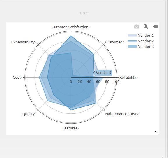
RADAR
Jump to navigation
Jump to search
RADAR CHART
Description:
Bubble chart is used when we want to represent 3 sets of data in a graphical way.
Out of those three data sets used to make the bubble chart, it shows two axis of the chart in a series of XY coordinates and a third set shows the data points.
- Every bubble chart consists of 3 data sets. X-axis coordinate, Y-axis coordinate, and the bubble size data set.
- So with the help of X & Y axis, you can visualize a third data set through the image of bubbles.
- It is a X vs Y vs Z graph.
Example
| A | B | C | D |
| Vendor 1 | Vendor 2 | Vendor 3 | |
| Reliability | 65 | 73 | 49 |
| Customer Service | 68 | 6 | 72 |
| Customer Satisfaction | 80 | 54 | 92 |
| Expandability | 70 | 68 | 62 |
| Cost | 66 | 70 | 52 |
| Quality | 64 | 73 | 54 |
| Features | 67 | 66 | 72 |
| Maintenance Costs | 72 | 59 | 80 |
RADARCHART(A1:D9)
GRAPHING MAIN PAGE
