Difference between revisions of "PIE"
Jump to navigation
Jump to search
(Created page with "<div style="font-size:30px">'''PIE'''</div> ==='''''Description:'''''=== '''''A pie chart (or a circle chart) is a circular statistical graphic, which is divided into slices t...") |
|||
| (5 intermediate revisions by the same user not shown) | |||
| Line 1: | Line 1: | ||
<div style="font-size:30px">'''PIE'''</div> | <div style="font-size:30px">'''PIE'''</div> | ||
==='''''Description:'''''=== | ==='''''Description:'''''=== | ||
| − | '''''A pie chart (or a circle chart) is a circular statistical graphic, which is divided into slices to illustrate numerical proportion.<br> | + | '''''A ''pie chart'' (or a circle chart) is a circular statistical graphic, which is divided into slices to illustrate numerical proportion.<br> |
'''''In a pie chart, the arc length of each slice (and consequently its central angle and area), is proportional to the quantity it represents.'''''<br> | '''''In a pie chart, the arc length of each slice (and consequently its central angle and area), is proportional to the quantity it represents.'''''<br> | ||
| + | *'''''It is a X vs Y graph.''''' | ||
| + | **'''''X-axis and Y-axis represents one set of data respectively. | ||
==Example== | ==Example== | ||
| Line 24: | Line 26: | ||
|} | |} | ||
| − | ''' | + | '''PIE(A1:B7)'''<br><br/> |
| − | [[File: | + | [[File:Pie.JPG]]<br><br/> |
| + | [[GRAPHING|'''''GRAPHING MAIN PAGE''''']] | ||
Latest revision as of 07:34, 3 June 2020
PIE
Description:
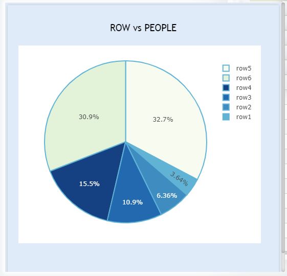
A pie chart (or a circle chart) is a circular statistical graphic, which is divided into slices to illustrate numerical proportion.
In a pie chart, the arc length of each slice (and consequently its central angle and area), is proportional to the quantity it represents.
- It is a X vs Y graph.
- X-axis and Y-axis represents one set of data respectively.
Example
| A | B | |
| 1 | Row | People |
| 2 | Row1 | 4 |
| 3 | Row2 | 7 |
| 4 | Row3 | 12 |
| 5 | Row4 | 17 |
| 6 | Row5 | 36 |
| 7 | Row6 | 34 |
PIE(A1:B7)
GRAPHING MAIN PAGE
