Difference between revisions of "CHOROPLETHBASICTILE"
Jump to navigation
Jump to search
| Line 1: | Line 1: | ||
| − | <div style="font-size:30px">''' | + | <div style="font-size:30px">'''CHOROPLETH MAP'''</div> |
==='''''Description:'''''=== | ==='''''Description:'''''=== | ||
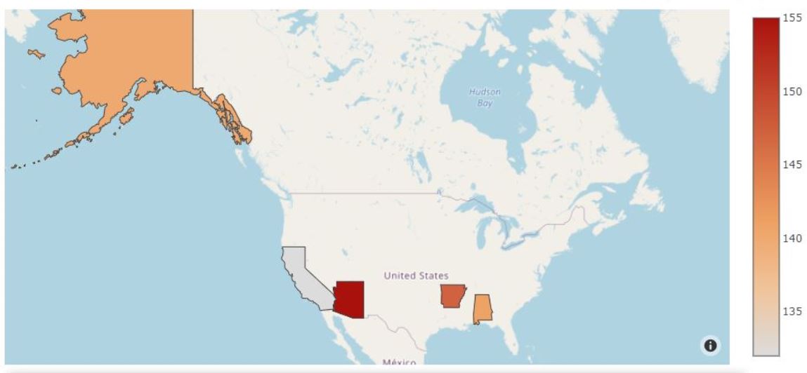
| − | *'''''A | + | *'''''A choropleth map is a type of thematic map in which a set of pre-defined areas is colored or patterned in proportion to a statistical variable that represents an aggregate summary of a geographic characteristic within each area, such as population density or per-capita income.'''''<br> |
| − | *''''' | + | *'''''Choropleth maps provide an easy way to visualize how a variable varies across a geographic area or show the level of variability within a region.''''' <br> |
*'''''Bubble Maps are good for comparing proportions over geographic regions without the issues caused by regional area size, as seen on Choropleth Maps.''''' <br> | *'''''Bubble Maps are good for comparing proportions over geographic regions without the issues caused by regional area size, as seen on Choropleth Maps.''''' <br> | ||
*'''''A major flaw with Bubble Maps is that overly large bubbles can overlap other bubbles and regions on the map, so this needs to be accounted for.''''' <br> | *'''''A major flaw with Bubble Maps is that overly large bubbles can overlap other bubbles and regions on the map, so this needs to be accounted for.''''' <br> | ||
Revision as of 14:30, 10 January 2021
CHOROPLETH MAP
Description:
- A choropleth map is a type of thematic map in which a set of pre-defined areas is colored or patterned in proportion to a statistical variable that represents an aggregate summary of a geographic characteristic within each area, such as population density or per-capita income.
- Choropleth maps provide an easy way to visualize how a variable varies across a geographic area or show the level of variability within a region.
- Bubble Maps are good for comparing proportions over geographic regions without the issues caused by regional area size, as seen on Choropleth Maps.
- A major flaw with Bubble Maps is that overly large bubbles can overlap other bubbles and regions on the map, so this needs to be accounted for.
- Bubble Map has X & Y axis.
- It is a X vs Y graph.
- X-axis represents one set of data.
- Y-axis can represent single set of data.
Example
| A | B |
| Longitude | Latitude |
| -73.99 | 40.7306 |
| -118.24 | 34.0537 |
| -95.37 | 29.7589 |
| -75.16 | 39.9523 |
CHOROPLETH(A1:D4)
GRAPHING MAIN PAGE
