BUBBLE MAP
Jump to navigation
Jump to search
BUBBLE MAP
Description:
A bubble map uses circles of different size to represent a numeric value on a territory.
It displays one bubble per geographic coordinate, or one bubble per region (in this case the bubble is usually displayed in the baricentre of the region).
Bubble Maps are good for comparing proportions over geographic regions without the issues caused by regional area size, as seen on Choropleth Maps.
a major flaw with Bubble Maps is that overly large bubbles can overlap other bubbles and regions on the map, so this needs to be accounted for.
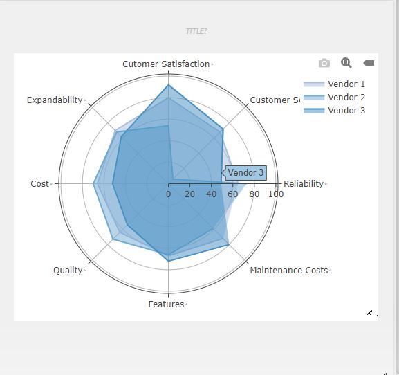
- Bubble Map has X & Y axis.
- The x-axis is nothing but each end of the spider and each step of the spider considered as Y-axis.
- Zero point of the radar chart starts from the centre of the wheel. Towards the edge of the spike, a point reaches, the higher the value.
- It is a X vs (Y1,[Y2]....) graph.
- X-axis represents one set of data.
- Y-axis can represent single or multiple data sets.
Example
| A | B | C | D |
| Vendor 1 | Vendor 2 | Vendor 3 | |
| Reliability | 65 | 73 | 49 |
| Customer Service | 68 | 6 | 72 |
| Customer Satisfaction | 80 | 54 | 92 |
| Expandability | 70 | 68 | 62 |
| Cost | 66 | 70 | 52 |
| Quality | 64 | 73 | 54 |
| Features | 67 | 66 | 72 |
| Maintenance Costs | 72 | 59 | 80 |
RADARCHART(A1:D9)
GRAPHING MAIN PAGE
