DONUT
Jump to navigation
Jump to search
DONUT
Description:
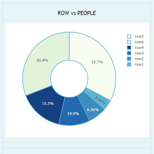
The donut chart is a variant of the pie chart, with a hole in its center, and it displays categories as arcs rather than slices.
- It is a X vs Y graph.
- X-axis and Y-axis represents one set of data respectively.
Example
| A | B | |
| 1 | Row | People |
| 2 | Row1 | 4 |
| 3 | Row2 | 7 |
| 4 | Row3 | 12 |
| 5 | Row4 | 17 |
| 6 | Row5 | 36 |
| 7 | Row6 | 34 |
DONUT(A1:B7)
GRAPHING MAIN PAGE
